Guide to Mobile UX Design
Businesses need to spend more money on user research and product development as the online market changes and develops. These suggestions will help you get a greater return on your mobile UX design.

What is Mobile User Experience (UX) Design?
Mobile User Experience (UX) Design entails crafting mobile websites, applications, and digital products to provide mobile device users with the most optimal and enjoyable interactions. This encompasses how users engage with digital products on smaller screens, varying device designs, and a range of input methods, such as touch screens. The primary objective of mobile UX designers is to develop products that are user-friendly, easily accessible, and naturally intuitive for those using mobile devices.
The process typically commences with user research to pinpoint the target audience and discern their needs, followed by establishing the product’s objectives and goals. This is followed by creating wireframes and prototypes, rigorous testing, and design refinements. The overall aim of mobile UX design is to deliver a product that is effortless to navigate, provides the necessary functionality and information, and minimises user frustration and ambiguity.
Why is Mobile UX Important?
Mobile UX is important for several reasons:

The growing usage of mobile devices:
As smartphones and tablets continue gaining popularity, people increasingly rely on portable devices to access the internet and engage with digital content. It’s essential to ensure that these products offer a delightful and smooth experience on mobile devices.
User expectations:
Digital products should be user-friendly for those on mobile devices and should be tailored to suit their specific needs. Failing to meet these expectations may prompt users to switch to a competing product.
Impact on business objectives:
A positive mobile user experience can enhance brand loyalty, foster customer engagement, and boost conversion rates, all of which can help businesses achieve their objectives. Conversely, a subpar mobile UX can have the opposite effect, tarnishing a brand’s reputation and negatively impacting business outcomes.
Enhanced accessibility:
Effective mobile UX design plays a role in promoting greater accessibility for users with disabilities. For instance, designing for touch screens and using larger text can make products more usable and accessible for individuals with visual impairments.
Mobile UX holds significant importance as it directly influences the overall user experience, customer satisfaction, and the outcomes for digital products. Therefore, a well-crafted mobile UX can provide a competitive edge and drive success in today’s mobile-centric world.
Read: Can UI/UX Impact your Search Engine Ranking?
How to Design Mobile UX?
Designing mobile UX, or user experience, requires careful consideration of the unique constraints and opportunities of the mobile platform. Here are some critical steps to creating effective mobile UX:
Identify user needs and goals –
To learn how users interact with mobile devices and what they want from a mobile app or website, conduct user research.
Focus on simplicity and clarity –
You must avoid cluttered interfaces and prioritise essential information. Understand that mobile screens are smaller, and users are often on the go, so it’s important to design for simplicity and clarity.
Use responsive design –
Make sure your designs are optimized for different screen sizes and orientations. Use responsive design techniques to ensure your app, or website looks good on any device.
Mobile users expect simple and intuitive navigation that is easy to use with one hand. Use clear icons and labels, and minimize the clicks or taps required to complete a task.
Prioritize performance –
Mobile users expect fast and responsive apps or websites. Try to optimise images so that the loading time of the website is reduced. Higher the loading time, more will be the bounce rate.
Test and iterate –
Use user testing and analytics to understand how users interact with your app or website and make adjustments to improve the user experience.
Mobile App Vs Mobile Web UX Design
Let us read how mobile App differs from web UX design
| Mobile App UX Design | Mobile Web UX Design |
| Designed for specific operating systems (e.g. iOS, Android) | Designed for mobile browsers |
| Must be downloaded from app stores | Accessible from any device with internet access |
| Can provide a more seamless and integrated experience | Limited in terms of interactivity and integration with device |
| Involves programming languages (e.g. Swift, Java) | Involves web technologies (e.g. HTML, CSS, JavaScript) |
| Must be reviewed and approved by app stores | Easier to update and maintain |
| Can be a challenge for new or unknown products to be discovered | Easily discoverable through search engines or links from other websites |
Best Mobile UX Designs
There are several types of mobile UX design, each with its own unique set of challenges and considerations:
Responsive design:

A responsive design is about creating websites or applications that adjusts with various screens and resolutions.
When the user gets a consistent experience across devices it is called responsive design which should be the aim of the designer.
Apple is a prime example of a company that has adopted responsive design. Whether you use a desktop computer, tablet, or smartphone, Apple’s website is optimised to provide an excellent viewing experience on various devices and screen sizes.
The website adapts its layout and elements to ensure the design remains responsive. For instance, to save space, the navigation menu may be reduced to a hamburger menu on smaller screens, while it may display as a full horizontal menu on larger screens.t.
Native app design:
A mobile UX design that is developed dedicated to a particular operating system (such as iOS or Android) and built using platform-specific tools and languages is referred as Native App Design.
These apps are difficult to develop but they provide more integrated and seamless user experience.
One such Native app for illustration is that of Airbnb. Its app is made to have an intuitive user interface with simple navigation, big images, and a tidy layout. It makes use of native mobile features like pull-to-refresh, map integration, and swipe gestures.
The color palette and typography are same across different platforms which makes it easy for users to recognise and trust the app.
This app is optimised for iOS and Android platforms, taking advantage of each platform’s unique design elements and functionality.
Progressive web app design:
Progressive web apps (PWAs) are web-based programs. These apps have same functionality as that of native apps and these can be installed on a user’s device.
PWAs can be accessed directly from the home screen without the need for an app store because they are made to function offline.
The Twitter app is one example of a well-designed progressive web app (PWA). This app offers a quick and reliable experience, similar to a native app. The only issue is that it is accessible through a web browser.
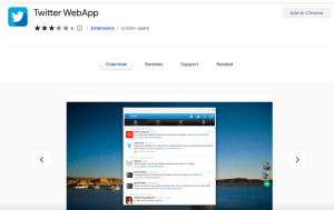
Progressive Web Application uses modern web technologies.
Users can easily navigate and find what they’re looking for thanks to the app’s simple, minimalist design. The app development makes use of responsive design to ensure the app looks and functions great on all devices, including desktop and mobile.
The color palette and typography are consistent with Twitter’s brand identity, giving users a familiar and trustworthy experience. The Twitter PWA is an excellent example of a well-designed progressive web app that provides a seamless user experience across devices.
Hybrid app design:
The apps that combine both the native and web-based technologies and can provide the best of both worlds are hybrid apps.
These apps are built using web technologies but run within a native app container. The app gives access to device capabilities and a more seamless user experience.
The Uber app is one illustration of a well-designed hybrid mobile app. The Uber app can be used on iOS and Android devices because it was developed using native code and web technologies.
The app provides a seamless user experience, with a clear and understandable interface and fluid screen transitions. The built-in mobile features like GPS, push notifications, and in-app purchases offers great user experience.
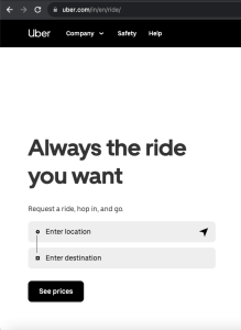
Uber’s brand identity is consistent with the color scheme and typography, making for a recognizable and reliable experience. The app is additionally user experience and performance optimised, making it quick and responsive even on networks with poor signal quality.
Wearable app design:
This mobile UX design that involves creating applications for wearable devices like smartwatches or fitness trackers are wearable app designs.
These apps requires a unique set of considerations, including small screen sizes, limited input methods, and the need for quick and easy navigation.
The Nike Run Club smartwatch app is one instance of a well-designed wearable app. Their app enable runners to keep track of their workouts and set goals. Large buttons and clear graphics on the interface make it simple and convenient to use even when you’re on the go.
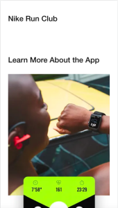
It utilizes the unique features of smartwatches, such as heart rate monitoring, GPS, and wrist gestures, to provide a convenient and immersive user experience.
Nike’s brand identity is maintained in the color scheme and typography, providing users with a dependable and comfortable experience. The app is performance and battery life optimized to ensure a seamless user experience and uninterrupted use throughout a workout.
An excellent illustration of a wearable app with a great user interface for fitness enthusiasts is the Nike Run Club app.
Some other Mobile UX Design Examples
Here are some examples of well-designed mobile UX:
- Amazon: With features like customised product recommendations, one-click ordering, and access to Amazon’s sizable product catalog, the Amazon mobile app offers a thorough shopping experience.
- Google Maps: With real-time traffic updates, voice-guided navigation, and the option to save maps for offline use, the Google Maps mobile app offers a seamless navigation experience.
- Instagram: With features like photo and video sharing, in-app editing, and a feed-based navigation system, the Instagram mobile app offers a social networking experience that is primarily focused on visual content.
These examples demonstrate how mobile UX design can provide a seamless, intuitive, and enjoyable user experience while also achieving specific goals and objectives.
Best Practices for Mobile UX Designing
Here are some best practices for designing effective mobile UX:
Focus on simplicity:
The design should be simple. Keep in mind that mobile devices have smaller screens and fewer input options when creating designs. Reduce clutter, speak simply, and include clear calls to action.
Use gestures and animations:
Mobile devices provide distinctive input options, like touch and swipe, which can be taken advantage of to produce a more engaging and simple user interface. To give feedback, enhance navigation, and improve the app’s overall feel, use gestures and animations.
Optimise for touch:
As touch is the primary input method for mobile devices, it is essential to design for touch interactions. Use large, easy-to-press buttons, and provide clear feedback for touch events.
Consider the context of use:
Mobile devices are frequently used while moving around, in numerous situations, and while being preoccupied by various things. Consider the context of use when designing, and make sure your app is easy to use and navigate even in less-than-ideal situations.
Provide offline access:
Make sure that when designing your app, it’s crucial to keep in mind that mobile devices can be used offline. The crucial information and features must be accessible even without an internet connection.
Making navigation intuitive and simple to use is crucial because it is a crucial part of the mobile user experience. Use recognizable patterns and icons, give users clear labels, and make sure they are aware of their location in the app.
Test and iterate:
Testing and iteration are ongoing processes in mobile user experience. For the best user experience, constantly seek user feedback, test your designs, and make adjustments.
By following these best practices, you can create an effective mobile UX that is intuitive, engaging and meets the needs of your users.
Mobile UX Design- A Case Study
Here’s a case study of how mobile UX design can impact the success of a product:
Case Study: The Netflix Mobile App
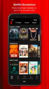
Netflix is a streaming service that provides access to a vast library of movies and TV shows. The Netflix mobile app was designed to provide an enjoyable and seamless streaming experience for users on the go.
Problem:
The slow loading times, perplexing navigation, and absence of offline access were frustrating Netflix mobile app users.
Solution:
In-depth user testing and research were conducted by the Netflix team to pinpoint the shortcomings of the mobile app. They made a number of design improvements in light of their findings, including:
- Simplifying the navigation enabling users to find and watch content.
- Providing offline access enabling users to download and view content even without an internet connection.
- Enhancing the experience overall by speeding up the load times to further decrease frustration.
Result:
After the changes, the users responded to the mobile app. It raised engagement and satisfaction levels. And this contributed to the massive growth of the channel.
This case study highlights the significance of conducting in-depth user research and testing as well as how successful mobile UX design can boost user engagement, satisfaction, and a product’s success.
Conclusion
In conclusion, a mobile product’s success depends heavily on its mobile user experience (UX) design. So when you are to launch an application, note that the design should be enjoyable and seamless experience for users on the move.
Stick to the best practices for mobile UX design include putting an emphasis on simplicity, optimizing for touch, taking into account the context of use, offering offline access, creating intuitive navigation, and continuously testing and iterating. For the creation of your mobile UX design, you can contact us. Please send emails to hello[at]noboruworld.com
FAQ’s
What is mobile UX UI?
Mobile UX UI refers to the user experience and user interface design. The apps are for portable electronic devices like smartphones and tablets. Mobile UX UI encompasses designing how users interact with and use a product on a mobile device, as well as how the product visually displays information and performs for the user.
What is one of the most important aspects of mobile UX design?
Usability is one of the most important components of mobile UX design. The term “usability” describes how simple it is for users to complete their objectives and tasks when utilizing a product. Given the constrained screen size and input options on mobile devices as well as the requirement that the product be usable in a variety of settings and circumstances, this is especially crucial. Designers must concentrate on making a mobile product intuitive and simple to use, with clear navigation, well-thought-out interactions, and a streamlined interface, in order to ensure that it is functional.


