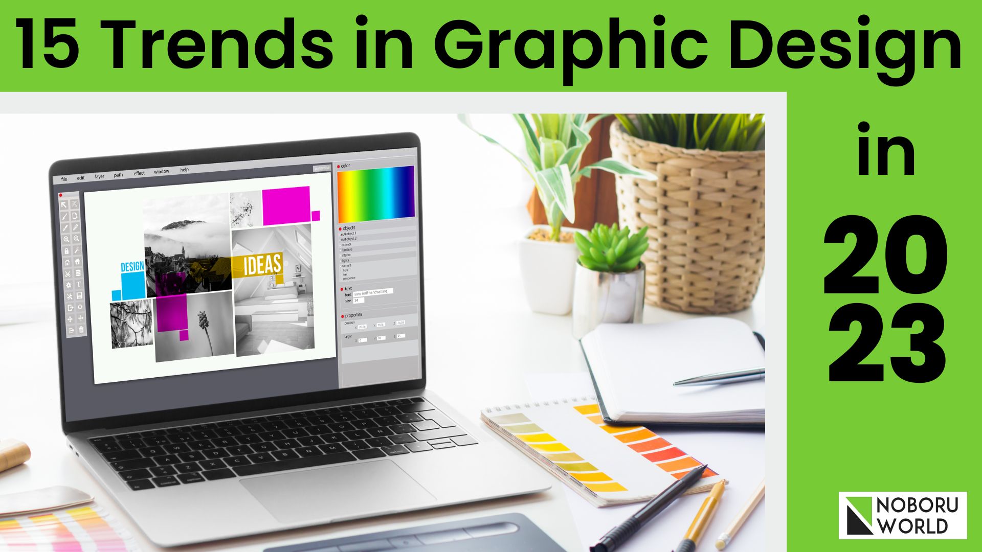
15 Trends in Graphic Design in 2023
93% of all our communication is visual. It is because brands believe consistent graphic designs in ads and posts can lift the sales by 33% (Source: Truelist).
The graphic design industry is gaining momentum as companies become increasingly aware of the power of design in building their brand, engaging with customers, and achieving their marketing goals.
In addition, the rise of digital media and the growing demand for visual content, combined with advancements in technology and the widespread adoption of digital tools, has created new opportunities for graphic designers and driven growth in the industry.
This trend is expected to continue as businesses increasingly seek graphic designers’ creative and technical expertise to help them stand out in an increasingly competitive digital landscape.
Let us read further to know the trends of graphic design.
Overview Of The Graphic Design Industry
These are the statistics that may open your mind towards the rapid development in the graphic design industry.
| Global Graphic Design Industry | Worth and Growth Statistics |
| Industry Worth | $43.4 billion |
| Growth in 2022 | 3.7% |
| Average Growth (2017-2022) | 0.6% per year |
Note: The statistics presented are based on available data and may have changed over time.
What Is Graphic Design?
Graphic design is a field that involves the use of visual elements, such as typography, images, and colour, to communicate messages and ideas. Graphic designers use a combination of technical skills, creativity, and strategic thinking to produce designs that meet the needs of their clients and target audience.
The designs can take many forms, including logos, brochures, websites, packaging, advertisements, and many others. The goal of graphic design is to visually communicate information in a clear, appealing, and effective way, whether it’s to convey a message, sell a product, or simply entertain.
As a result, graphic designers play a vital role in helping businesses and organisations communicate effectively with their audience in a visual world and stay in trend.
Why are we talking of trend?
In the graphic design context, a trend refers to a particular style, technique, or approach gaining popularity or influence in the industry.
It’s a ripple effect created by a confluence of events, ideas, and emerging technologies that spreads and evolves, influencing how graphic designers approach their work and their choices.
Importance Of Staying Current With Graphic Design Trends
Staying current with graphic design trends is essential for several reasons:
- Stay Competitive: Graphic design is constantly evolving, and staying current with the latest trends and techniques can help designers remain competitive and relevant in the industry.
- Keep Skills Fresh: Staying current with trends can help designers continue developing their skills and learn new techniques and tools. This can lead to greater creativity and innovation in their work.
- Better Serve Clients: Knowing the latest trends and styles can help designers better understand their client’s needs and preferences and create more relevant and practical designs.
- Stay Ahead of the Curve: By staying current with trends, designers can be ahead of the curve and ready for the next big thing in design. This can help them stay ahead of their competition and create innovative and cutting-edge techniques.
- Inspiration: Keeping up with the latest trends can provide designers with new sources of inspiration and ideas they can incorporate into their work.
15 Trending Graphic Design Styles For 2023
Let us now look at the 15 graphic design trends for 2023.
Trend 1: Systematic
- The systematic trend in graphic design refers to a methodical and organised approach to design that follows a set of structured rules and principles. Idea is to create an aesthetic thread between the range of items.
- This approach is characterised by grid systems, typographical hierarchies, and a strong focus on visual consistency and balance.
- Systematic design is often associated with clean and modern aesthetics and can be seen in many areas of graphic design, such as branding, packaging, and web design.
- The systematic approach to design can help designers create clear, organised, and easily understood by their audience. It also enables designers to create scalable and flexible designs, allowing them to adapt to different formats and devices without losing their visual coherence.
- By following a systematic approach, designers can create visually appealing layouts, effective in communicating their message and easy to use.
- Staying in trend with the systematic graphic design approach is Apple Inc. Apple is known for its clean, minimalistic design aesthetic, characterised by a strong focus on typography, simplicity, and a strict grid system.
Apple’s use of typography is particularly noteworthy, with consistent use of the company’s proprietary San Francisco font in all of its marketing materials. Apple’s logo is also an example of its systematic approach, simple design, negative space, and monochromatic colour palette.
Apple’s systematic approach to graphic design helps to create a strong and recognizable brand identity, making it one of the most recognizable brands in the world. By using consistent visual language across all of its products and marketing materials, Apple creates a sense of unity and coherence, which sets it apart from its competitors and strengthens its brand.
Trend 2: Midjourney and AI
- Midjourney trend in graphic design refers to a style that incorporates elements from both traditional and modern design approaches. brings a new level of creativity and sophistication to design, while the AI trend promises to revolutionise the design process and make it more efficient and effective.
- Compared to other graphic design trends, the Midjourney trend seeks to find a balance between these opposing forces. By blending conventional hand-drawn elements with modern typography and technology, designers can create both innovative and timeless designs that connect with people on an emotional level and deliver a powerful brand experience.
- This trend is characterised by using hand-drawn and organic elements, combined with clean, geometric shapes and digital typography. In mid journey, it has science-fiction or a fantasy leaning to it. A hybrid style blends the best of both worlds and creates a unique and contemporary look.
- The AI trend in graphic design refers to using artificial intelligence and machine learning algorithms to automate and enhance various aspects of the design process. AI-powered design tools can help designers to generate designs faster, with greater accuracy and consistency, and with less effort.
- AI can also analyse data, such as customer preferences and market trends, and provide insights that can inform the design process. The Midjourney and AI trends in graphic design are both critical trends shaping the industry’s future.
- By staying current with these trends, designers can continue pushing the boundaries of what’s possible and create innovative, effective, and engaging designs.
- Some brand examples of AI trends in graphic design include Adobe. Adobe is at the forefront of the AI trend in graphic design, offering a suite of AI-powered design tools to help designers work more efficiently and effectively. For example, Adobe XD uses AI to automate repetitive tasks, such as auto-layout, resizing, and formatting, freeing designers to focus on more creative tasks.

Source: www.adobe.com
Adobe’s AI tools can also analyse and process large amounts of data, such as customer preferences and market trends, to provide designers with valuable insights that can inform their design decisions. Additionally, Adobe’s AI tools can generate and suggest new design ideas and styles, helping designers to expand their creativity and explore new possibilities.
- In another example, Airbnb poses a Midjourney trend in graphic design. The brand’s logo perfectly represents this trend, with its simple and iconic design incorporating hand-drawn elements and a warm colour palette. In addition, the logo symbolises the brand’s approach to hospitality, which is rooted in community, comfort, and a human touch.

The Midjourney graphic design trend combines traditional and modern design elements, blending the best of both worlds to create a unique and contemporary look. In the case of Airbnb, the brand’s use of hand-drawn elements and a warm colour palette make sense of warmth and welcome, while it’s simple and modern typography reflects the brand’s focus on innovation and efficiency.
Trend 3: Collage
- Collage is a popular trend in graphic design, characterised by the use of cut-and-paste techniques to create a composition from various elements. This trend is characterised by using multiple textures, patterns, and images, which are combined in an eclectic and sometimes chaotic manner to create a unique and eye-catching design.
- The collage trend in graphic design is often used to create a sense of energy, movement, and playfulness. Therefore, it is particularly well-suited to methods aimed at a youthful or alternative audience.
- College designs can be used for various purposes, including advertising, packaging, and editorial design. Adobe Creative Cloud is a classic example of graphic design.

Source: www.adobe.com
- Adobe Creative Cloud is a collection of graphic design, video editing, and web development software applications provided by Adobe Systems. For example, the “Collage” feature in Adobe Creative Cloud typically refers to a layout style in which several visual elements are arranged together to form a single image. In Adobe’s software suite, several tools and applications, such as Adobe Photoshop and Adobe InDesign, allow users to create collages as part of their design projects.
- Brand example of using the collage trend in graphic design is Converse. The brand is well-known for its iconic sneaker designs, which often feature collage-style graphics, combining different textures, patterns, and images in an eclectic and playful manner.
For example, Converse’s Chuck Taylor All-Star shoes often feature collage-style graphics on the upper, inspired by various sources, including music, art, and popular culture. These graphics are often playful, quirky, and bold, reflecting the brand’s unique and irreverent personality.

Source: www.pinterest.com
The converse is an excellent example of a brand that uses collage graphic design significantly. By staying current with this trend, designers can create bold, quirky, and memorable designs that deliver a powerful impact for their clients.
Trend 4: Holo-Morph
- The “Holo-morph” trend in graphic design refers to holographic or iridescent elements in design work, often with a futuristic, sci-fi-inspired aesthetic.
- This design trend brings a sense of movement and ongoing evolution. The idea communicates a futuristic and a high-tech aesthetic that can be used in app design,advertising, etc.
- This trend involves using geometric or amorphic shapes, metallic gradients, and other holographic effects to create a multidimensional, shimmering look.
- The Holo-morph trend is often used in branding, packaging, website design, and advertising to add a unique, eye-catching touch to the design.

Source:www.google.com
- One example of a brand incorporating the Holo-morph trend in its graphic design is Fenty Beauty, the cosmetics brand founded by Rihanna. Fenty Beauty’s branding often features iridescent, holographic packaging and visual elements, adding a futuristic and eye-catching touch to their product lines.

Source:www.google.com
- Another example of a brand that has used the Holo-morph trend in its graphic design is Huda Beauty, which incorporates iridescent, holographic elements in its packaging and marketing materials.
Trend 5: Military Inspired
- Military-inspired graphic design refers to a design style that incorporates elements and visual cues from military uniforms, equipment, and insignia.
- This style often includes robust and bold typography, geometric shapes, and a limited colour palette, including olive greens, blues, and greys. The brands may use Sans Serif Font and simple linear designs, abbreviations, numbers, and technical information.
- White space use is important and severely restricts the use of colours.
- The designs may also have patches, badges, and other insignia inspired by military emblems. Military-inspired graphic design can be found in branding and marketing materials, clothing and accessories, and packaging.
- It’s often used to convey a sense of strength, power, and ruggedness.
- Some brand examples that adopt to Military Designs include
- Ruffians: An Indian streetwear brand that incorporates military-inspired graphic elements, such as bold typography, patches, and limited colour palettes, into their designs.

Source: www.google.com
- ALCIS: An Indian sportswear brand that often incorporates military-inspired graphic elements, such as solid typography and camouflage patterns, in its product lines.

Source: www.behance.com
- INVICTUS: An Indian brand that offers a range of military-inspired fashion products, such as jackets, t-shirts, and accessories, featuring graphic elements inspired by military insignia and patches.
Trend 6: Dark Mode Typography
- Dark mode typography in graphic design refers to typography in a dark colour palette, usually black or very dark shades of grey, in a format that primarily uses dark background colours.
- This approach to typography is used to create a dramatic and moody effect in digital products, such as websites and mobile apps. In a dark mode interface, the text is typically set in lighter colours, such as white or light grey, to ensure legibility against the dark background.
- In addition, dark mode typography is often used to create a modern, sleek look and reduce eye strain when used in low-light conditions.
- Dark mode typography Dark mode typography in graphic design is used for several reasons:
- User experience: Dark mode is designed to be easier on the eyes and reduce eye strain when used in low-light conditions, making it a popular choice for reading and writing content on electronic devices.
- Aesthetic appeal: Dark mode creates a sleek, modern look and can dramatically affect a design.
- Energy efficiency: Using a dark background can help extend the battery life of electronic devices, as the backlight does not have to work as hard to illuminate the screen.
- Branding: Dark mode can help establish a unique visual style for a brand and can be used to create a consistent look across different digital products.
- Accessibility: Dark mode can be helpful for users with visual impairments, as it can increase contrast and make the text easier to read.
- Brand example that uses dark-mode graphic design is Apple. The design is characterised by a dark colour palette, usually black or very dark shades of grey, that creates a sleek and modern look. The interface design is easy on the eyes and reduces eye strain, especially in low-light conditions. The text is set in light colours, such as white or light grey, to ensure legibility against the dark background. The overall look is clean, simple, and elegant, focusing on typography and negative space.

Source: www.apple.com
In addition to the dark mode interface, Apple also uses other design elements, such as depth and transparency, to create a sense of hierarchy and a visually rich experience. The use of dark mode also helps extend the battery life of electronic devices as the backlight does not have to work as hard to illuminate the screen.
Apple’s dark mode interface is used in several of their built-in apps, such as Apple Music, Apple Podcasts, and Apple Maps, as well as in the iOS operating system, helping to create a consistent look across different digital products. In addition, the dark mode interface is an integral part of Apple’s design philosophy, emphasising simplicity, functionality, and elegance.
Trend 7: Neu Brutalism
- Neu Brutalism is a recent graphic design trend inspired by the Brutalist architecture and design movement of the mid-20th century. Neu Brutalism in graphic design is characterised by a raw, unpolished aesthetic emphasising minimalism and blocky, sans-serif typefaces. Designs often feature rough, textured surfaces, heavy, contrasting typography, and bold, bright colours.
- The Neu Brutalism trend in graphic design is often used for alternative and subcultural products, such as zines, posters, and t-shirts, and in packaging design for niche products, such as craft beer and artisanal food. The trend is popular among young, alternative audiences and is often seen as a reaction to contemporary design’s clean, polished look.
- Neu Brutalism in graphic design departs from the sleek, polished aesthetic commonly associated with modern design. Instead, it focuses on raw, unrefined beauty and the imperfections that give a design character and individuality.
- Adidas, the athletic brand has used Neu Brutalism in its marketing materials, featuring bold, blocky typefaces and a raw, unpolished aesthetic designed to appeal to alternative and subcultural audiences.
Trend 8: 70’s Typography
- 70’s typography in graphic design is characterised by bold, sans-serif typefaces, bright and neon colours, and playful, eclectic use of typography. The 70s was a time of significant cultural and social change, reflected in the era’s graphic design, which often used typography to make a statement and convey a message.
- In 70’s typography, designers often used thick, blocky letters to create an impactful, attention-grabbing look. The use of bright, neon colours was also popular, as designers sought to reflect the energy and excitement of the time.
- The typography of the 70s was often playful and eclectic, with designers combining different typefaces, sizes, and colours to create unique and eye-catching designs.
- 70’s typography is often associated with the counterculture movement of the era, as well as the rise of new forms of media, such as television and rock music, which inspired designers to create bold and innovative designs.
- Today, 70’s typography is often used as a nostalgic reference, evoking the cultural and social upheaval of the era, as well as the spirit of experimentation and creativity that characterised graphic design in the 1970s.


Source: www.google.com
- McDonald’s: The fast food brand McDonald’s is known for its iconic “Golden Arches” logo, which features a simple, blocky sans-serif typeface reminiscent of the typography of the 1970s.
Trend 9: Lensa-tion
- Lensa-tion is a graphic design trend characterised by a playful and imaginative use of light and shadow. Designs often feature bold, contrasting light and dark elements, lens flares and other optical effects to create a sense of depth, movement, and energy.
- Lensa-tion designs often feature vibrant colours and a sense of dynamic movement and are often used to create eye-catching, attention-grabbing graphics. The trend is often used in advertising and marketing materials, particularly for products or brands associated with fun, excitement, and energy, such as sports equipment, toys, and video games.
- The graphic design trend often draws on the visual vocabulary of comic books and graphic novels, as well as science fiction and fantasy, to create a sense of excitement, wonder, and adventure.
- The trend is popular among younger audiences, who are drawn to its playful and imaginative use of light and shadow and its bold, vibrant colours and dynamic movement.

Source:www.google.com
- Xbox: The video game brand Xbox is known for its bold and impactful use of light and shadow, often featuring bright, vibrant colours and a sense of dynamic movement in its advertising and marketing materials.
Trend 10: Geo-Simplicity
- Geo-simplicity is a trend in graphic design that emphasises clean, simple, and geometric shapes and forms. Designs often feature minimalistic and reductive elements, focusing on simplicity, balance, and symmetry.
- The trend is characterised by using simple, clean lines and shapes, monochromatic colour schemes, and neutral backgrounds.
- Geo-simplicity designs often draw on the visual vocabulary of modernism and minimalism, as well as Bauhaus design principles, to create a sense of elegance, sophistication, and timelessness.
- The trend is popular in the fields of architecture, interior design, and product design, as well as in branding and marketing materials, where it is used to create a sense of order, stability, and reliability.
- Geo-simplicity is a versatile and adaptable trend that can be applied to various design contexts, from logos and branding materials to websites, packaging, and advertising.
- In addition, the trend is often used to communicate a sense of simplicity, clarity, and focus, making it an effective design solution for many projects.

Source: www.google.com
- For example, the technology company IBM is known for its simple and sophisticated design approach, featuring clean lines, geometric shapes, and neutral colours in its branding and marketing materials.
Trend 11: Cyberwave
- Cyberwave is a trend in graphic design that draws on the visual vocabulary of science fiction, technology, and cyberculture. Designs often feature bold, futuristic, and dynamic elements, neon colours, and stylised typography to create a sense of high-tech energy and excitement.
- Cyberwave designs often feature high-contrast colour palettes with bright neon colors, dark shadows, and outlines. The trend is often used to create eye-catching, attention-grabbing graphics and is popular in fields such as advertising, video games, and music.
- Cyberwave designs often draw on the visual language of cyberpunk and other science fiction genres, as well as cutting-edge technology and futurism, to create a sense of excitement, energy, and innovation. The trend is popular among younger audiences drawn to its bold, futuristic, and high-tech aesthetic. In addition, it is often used to create cutting-edge graphics and digital experiences.

Source: www.google.com
- Brand example that uses cyberwave graphic design is the science fiction movie franchise Tron. It is known for its bold and futuristic visual style, featuring neon colours, stylized typography, and high-tech graphics.
Trend 12: The BLOB
- The Blob is a trend in graphic design that emphasises organic and fluid shapes, often inspired by the forms and movements of nature. Designs often feature bold, curving, and dynamic lines and conditions, as well as bright colours and textures, to create a sense of movement, energy, and life.
- The Blob trend is often used to create eye-catching and attention-grabbing graphics and is popular in fields such as advertising, branding, and packaging. In addition, the trend is often used to create playful, fun, and engaging designs. It is particularly well-suited to projects that aim to communicate a sense of energy, movement, and excitement.
- This trend of graphic design often draws on the visual vocabulary of fluid dynamics and organic forms, as well as the aesthetics of Art Nouveau and abstract art, to create unique, dynamic, and eye-catching graphics.
- The trend is often used in branding and marketing materials, as well as in packaging and product design, to create playful, fun, and engaging designs.

Source: www.google.com
- The technology giant Google has used The Blob trend in some of its branding and marketing materials, featuring bold and fluid shapes in its logos, advertisements, and other graphics.
Trend 13: Vaporwave 3.0
- Vaporwave 3.0 is a graphic design trend that builds upon previous Vaporwave movements’ aesthetics. Like earlier Vaporwave trends, it often features futuristic and retro elements and themes of technology, consumer culture, and nostalgia. However, Vaporwave 3.0 often adds a more satirical and critical edge, exploring the darker aspects of digital culture and the impact of technology on society.
- The vaporwave trend combines vintage aesthetics from the 1980s and 1990s, including VHS tapes, 16-bit gaming graphics, pixelated text, iconic clothing brands like Nike and Adidas, retro logos like Adidas, Pepsi, and PlayStation, classic anime and cartoons like Sailor Moon and The Simpsons, and 90s electronics and computers.
- Other vaporwave design components could be video glitches, cyberpunk themes, Chinese and Japanese characters, Greek and Roman busts, roads, city skylines and panoramas, as well as more general geometric grids, lines, and shapes.
- All of this is unified by a specific colour scheme, which is typically built around pastel hues like pink and teal or striking neons.

Source: www.google.com
- This trend in graphic designing often features bright neon colours, stylized typography, and elements from pop culture and consumer products. In addition, the trend is often used to create playful, fun, and eye-catching graphics but also has a critical edge, exploring the darker aspects of digital culture and technology.
- The trend is popular among younger audiences and is often used in advertising, branding, and digital media. It is a fresh take on the Vaporwave aesthetic, which continues to evolve and adapt to changing cultural trends and technological advancements.
Trend 14: Globalvoice
- Global voice in graphic design refers to creating visual designs that effectively communicate the intended message to a worldwide audience, regardless of cultural, linguistic, or geographical differences.
- It involves considering cultural differences and creating universally understood designs that resonate with people from diverse backgrounds. The goal is to create designs that are inclusive, accessible, and culturally sensitive to reach a broad audience.
- An example of graphic design that uses a global voice is the iconic symbol for the Red Cross. The symbol is recognized as a universal symbol of help and assistance, and it has been used in countless countries to provide aid in times of need.

Source: www.google.com
The design is simple, straightforward, and easily recognizable, making it a great example of how graphic design can communicate a universal message. Another example is the “stick figure family”, often used to depict a diverse family without specific cultural markers, making it relatable and inclusive for a global audience.
Trend 15: Viva Magenta
- Graphic artists from all around the world are already inspired by Viva Magenta to create stunning websites, UI components, posters, and 3D animations. Let’s gear up for some incredible Viva Magenta graphic design examples in this blog post that will take us into 2023.
- After months of doom on the economic and geopolitical fronts, the viva magenta colour represents good transformation.
- If applied carelessly, the bright hue Viva Magenta risked taking over a design. However, it also has the ability to add a splash of colour, make a strong statement, or work in harmony with other design components.

Source:www.htmlburger.com
- Please keep the colour contrast ratios in mind as you explore these colour schemes. It might not be advisable to use dark colours for backgrounds or writing, like Viva Magenta. If you want to be sure that the colours you choose for text and backgrounds are eligible to people with the largest range of vision possible, use Webflow’s colour contrast checker or other tools like WebAIM.
Importance Of Incorporating Trending Styles Into Design Work
This is why incorporating trending styles into design works wonders:
- Increased use of augmented and virtual reality: With the rise of technology like AR and VR, designers can create more immersive and interactive designs to enhance the consumer experience.
- Focus on sustainability: As consumers become more environmentally conscious, designers will likely prioritise sustainable design practices and create more eco-friendly designs.
- Emphasis on personalization: With advancements in technology, designers can create highly personalised designs tailored to individual preferences and needs.
- Greater use of artificial intelligence: AI has the potential to revolutionise the design process by streamlining and automating many tasks, freeing up designers to focus on creativity and strategy.
- The blurring of lines between digital and physical design: As technology advances, the lines between digital and physical design will blur, leading to more integrated and holistic design solutions.
Final Thoughts
The future of graphic design is constantly evolving, driven by technological advancements and changing consumer behaviour. The future of graphic design is exciting and holds endless possibilities, as designers continue to push the boundaries of what’s possible and create new and innovative designs.


We would love to have your opinion.