Call-to-Action (CTA)
Definition
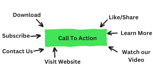
Call-to-action is a message to prompt the visitor on the website for an immediate response like purchase.
Description
You can have a website that gives a lot of information about the brand and the product/ services you offer. That is great but will that help you increase your revenue? No.
The idea of being there in the first place is to sell your services and generate income. For that you need to have a call-to-action as it encourages the users to take an action.
It also helps the interested users to make the purchase or follow an action as recommended.

Example
On an apparel website like that of Myntra, users can add clothes to their bag. They can see the “Add to bag” button under each item. And for the final purchase that will help the brand, there is a button “Proceed to Pay”. The two are important CTAs for Myntra.
Importance of Call-To-Action
This is why a call-to-action is important on a website:
- It acts as a signpost to let users know what is the next aim. It instructs the users on what to do next. Through CTA, you can ask your visitor to leave their information, download an eBook, or subscribe to monthly newsletters.
- Without CTA, a user might leave the site without knowing what to do next. CTA tells the users about the next action they can take. This is why the language of the CTA needs to be simple and intuitive. For example, Click Here, Learn More, Contact Us, etc.
- CTA motivates the audience to make the purchase. It actually encourages customers and regulates the success of a digital marketing campaign.
Ways in which you can write a Call-to-Action
A call to action is a digital marketing tool. It is a small content that directs the online link of the customers. This is how you can write a call to action:
- Tip1: Be authoritative. Start with authoritative language and direct people to “Shop”, “Join”, or “Buy”.
- Tip2: Make a good CTA at absolutely low risk. Let the audience be sure that they can find more without committing anything more.
- Tip3: Be persuasive. Use words that persuade people to follow directions. Keep the CTA intriguing.
- Tip4: Make it look urgent. Fear of missing out is the biggest fear these days. Like “Shop before it’s gone” OR “Last 30 minutes for Sale”.
- Tip5: Let the design be perfect so that the CTA pops-off the page. It has to be a colourful CTA button with white space around it.
Call-To-Action and Colors: What is in it?
This is what you have to keep in mind when designing CTA:
- Trick 1: Keep the CTA in eye-catching colours.
- Trick 2: Stay consistent with your brand colours.
- Trick 3: Keep CTA colour and design consistent on the website.
- Trick 4: Keep in mind the audience. Studies show that men prefer bold colours whereas women like softer shades.
- Trick 5: Pick the shade that matches your brand identity. Reserve the attractive colour for the CTA.
FAQs
What are the different types of CTAs?
These are the different types of CTAs:
- Form Submission: This type of CTA frequently requests information like first and last name, email, and phone number from visitors to your website in order to create your contact list.
- Lead generation: A strategy designed to spark initial interest in your product or service and increase website traffic.
- Read More Button: As its name implies, this CTA draws people to your website with teasers before directing them to the complete material. This enables blogs, articles, and other online content to draw their own traffic and receive full credit from search engines.
- Freebies: Draws new clients by providing them with access to a free or significantly reduced good or service.
- Closers for Sales Direct call-to-actions (CTAs) that close sales nudge website users to “Buy Now,” “Contact Sales Department,” or “Pay Here.”
Where should you place a CTA on a website?
You can place a CTA on either of these places:
- Above the Fold: This term describes the top section of your website, which visitors can view without having to scroll down. Sometimes it can be effective to place a CTA among the first things your visitors view. However, depending on how it’s applied, it can also come out as aggressive and unwelcoming. If you decide to add a CTA above the fold, studies show that doing so on the right side of the page will increase conversions.
- The page’s bottom: The call to action buttons at the bottom of the page are most frequently used to request information or enable visitors to share your material on social media
- Below the Fold: Anything on a website that a user must scroll down to view is referred to as being “below the fold.” When your website contains interesting content that will keep visitors reading and transforms your marketing into a narrative, this is most successful for CTAs. It can be beneficial to provide directional signals for CTAs that start above the fold and continue below the fold.
Also Read –
- Understanding Customer Experience (CX)-How to Create a Great One?
- 17 Call To Action Examples (+ How to Write the Perfect Social CTA)


We would love to have your opinion.